Creating this ring that I thought would be simple ended in a host of failures. The idea was to create a ring that was constrained in the middle, making it feel nice, a little different, easy to fidget with. The design was going to feature the band name, and triangles as a pattern that they have been using a lot in their imagery. 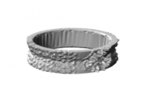 However, when I printed it, not only was it impossible for the printer to register anything that I had meshed into it, it cracked in half almost immediately.
Then I attempted to adjust the shape of the ring, to make it thicker and a little more strange and alien, and simplify the design. Again, what seemed like an easy enough task ended in failure. 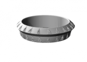 I made it just the triangle graphic the band uses, but it still went out instead of an indentation, because I thought even though it was small, it could create a cool texture. I never got to find out, because when I went to test print it, it went off-kilter quickly and had to be canceled before it spun out of control.
So the order was to make a thicker constrained in the middle ring. I started to run into a new issue a few times, though. A ring that was hollow and actually a ring in Fusion, would appear as a weird filled-in anomaly in Meshmixer.
 So it was me reworking, trying to find a new way to make the ring thick enough that it won’t crack where I constrained it, but without it filling in when I get to Meshmixer.
Fast forward to version 6. I’m tired, frustrated, and yet, miracle of all miracles, I’ve done it. I adjusted the thickness of the offset just right, did “thicken” in Fusion enough times, even if it didn’t appear to do anything. I found just the right way to make the circles intersect, and I finally could MOVE. ON. 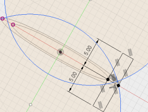 That sweet, sweet intersection that saved me.
Then I had simplified my design even more. I just used the exclamation point that is unique to the band I love so much and made that my pattern, pressing it in instead of embossing it so it would actually, finally work. It’s simple, but that suits me, and I’m happy. 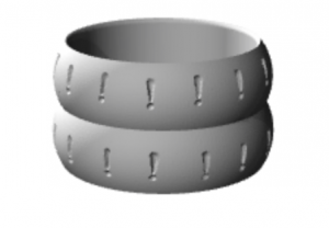
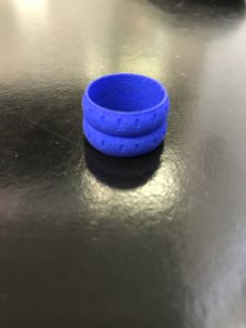 The final ring had the exclamation points just barely visible, but I think they are relatively clear. It’s closer to a texture than a design, which I’m kind of okay with, mostly because the ring shape makes it fun to toy with anyway, so the design just adds to that aspect. However, the “strong and flexible” material isn’t actually flexible, and the ring didn’t actually adapt to my holiday weight gain that went to my fingers, because while prototypes fit me, this does not (except on my thumb, so I suppose it’s a thumb ring now). But I’m glad that it came out well in the end!