Intro and Thoughts
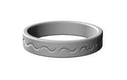
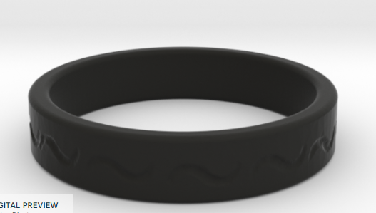
I really struggled with a design for this ring. I wanted something simple but detailed. I finally decided on using the tilde, or more commonly called, the squiggly thing below the escape button on most keyboards. I liked this design because I felt it was beautifully simple. I like my jewelry to be subtle and classy, so super “extroverted” jewelry I personally dislike. Hence, the simplicity. By the end of this assignment, I found that Fusion is definitely a very challenging program, but with some patience, I could really make something with it.
Design

I created the ring part just like everyone else did. Then I imported it into meshmixer, where I had to remesh the whole exterior several times so the image would come out clear. Then…I stamped the image in all around the ring. I found the spacing wasn’t always even and perfect, but I actually really like that about the ring. I like that it has a more natural or organic look like I carved it myself.

Finally, after I stamped the image in, I had to remesh to reduce the mesh of the outermost face as the file was HUGE and the non-stamped portion didn’t need to be so mesh-y.
Results
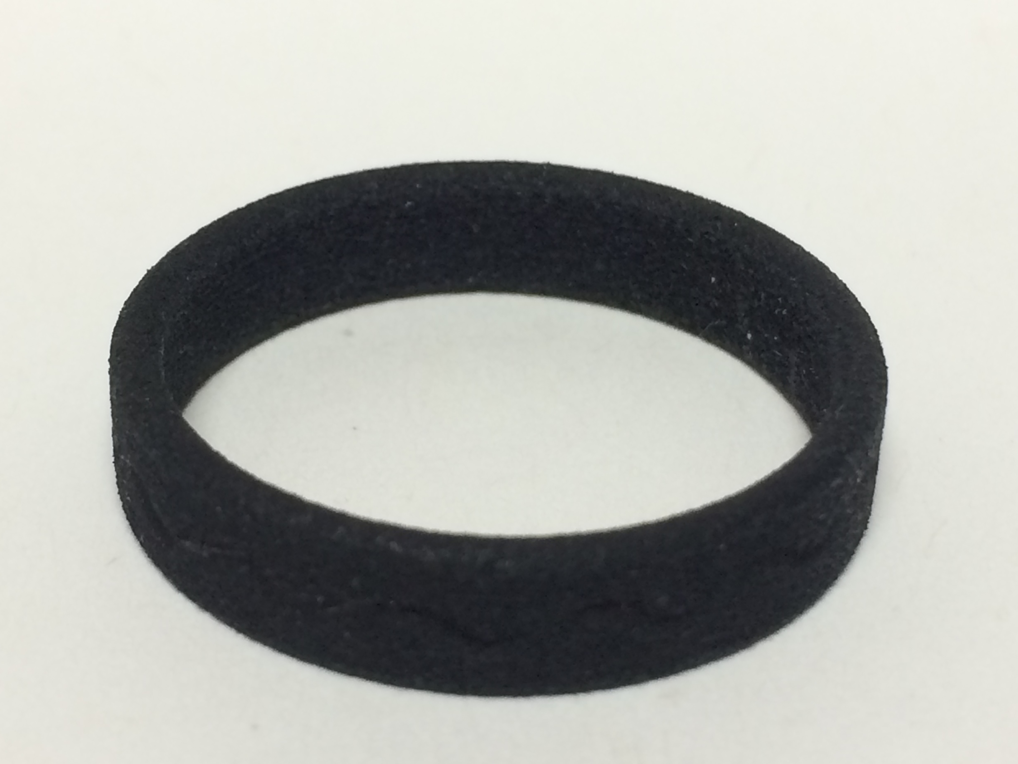
I ordered it on Shapeways in the Black Strong and Flexible Plastic. I am not thrilled with this material for the ring as it feels rough and does not show the design well. I have included a few of the pictures I took in person and a rendering from the website.
Feel free to order this ring in Platinum!
*note: all images are in “full size” mode.